
The Venue Project Overview

The Client: A wedding venue
The User: The engaged couple, their family, and other planners
The Problem: Offering clients a unique value proposition, such as a checklist app/website for clients to plan their events and stay organized while hosting their event at The Venue.
The Goal: Providing clients with the tools to plan their event and stay organized leading up to their big day to enhance their overall experience.
My Role: Lead User Experience Designer *I completed The Venue for a fictional client as course standards for the Coursera Google User Experience Design Course
My Responsibilities: End-to-End Design Process:
User research
Competitive analysis
Wireframing
High Fidelity Designs
Prototyping
Usability testing
Review and analysis of data
Refining and updating the design
Research Summary
During user research, I was interested in understanding how my target audience likes to stay organized and what issues they face when planning events.
In order to get an idea of this, I interviewed 5 people who have experience planning weddings. I asked them about their personal organization style and their experience planning a wedding.

“I keep checklists for everything. I need it written down, or I'll forget what I need to get done.” F28
“Time management was tough.” -M45
“My biggest challenge in planning mine and my daughter's weddings was the long-term planning. We’d have things that needed to be done this month and things that needed to be done next year on the same list.” F54
“Both of our parents have never been married, so we had no idea where to start and couldn't afford a planner.” M35
“I was so focused on the event that I forgot so many little things on the day of. I made my sister a night before packing checklist so she didn't run into the same issues I did on my wedding day.” F33
User Pain Points
Prioritizing Tasks Over a Long Period of Time
Organizing a Complex Event Without a Professional Planner
Where to Start
User Personas

26 & 25

Bachelor’s Degrees

Lake Buena Vista, Florida

Engaged

Store Manager & Real Estate Broker
Isabel & Diego
70 & 71
High School Diploma
Bay Lake, Florida
Married +4
Disney World Actors

Jason & Emilia
“Jason and I are planning our wedding on a budget so we are doing the bulk of the work ourselves. We are the first of our friends to get married, so we have no idea where to start or when things should be done.”


“We have been looking forward to giving our grandchild the wedding of her dreams since she was a girl. Our whole family will be involved in the planning, so we could use some tools to help us stay organized and plan.”
User Journey
Site Map
My goal while creating the site map for The Venue’s app and website was consistency and organization.
I aimed to give the user a tool that allows them to stay organized while planning such a complex event.
The Venue’s site map has evolved to become more thorough as I worked on the app and website.
Original Site Map

Final Site Map

Paper Wireframes
When I began brainstorming and creating paper wireframes for The Venue, my main goal was to make each page as simple as possible. I wanted my design to be clear, concise, and easy to use.
As I transitioned from designing the app to the website, I felt that the design of the checklist page was not working. I wanted to give my app something different that others do not have so I added in the timeline and restructured the checklists. This update helps the user stay more organized while planning their event.
In designing the alternate screen sizes for The Venue’s website I converted to a hamburger menu. This allowed me to condense important information in a universal way. The majority of users will understand the use of this type of navigation menu.
-
![]()
Home Screen Options [App]
-
![]()
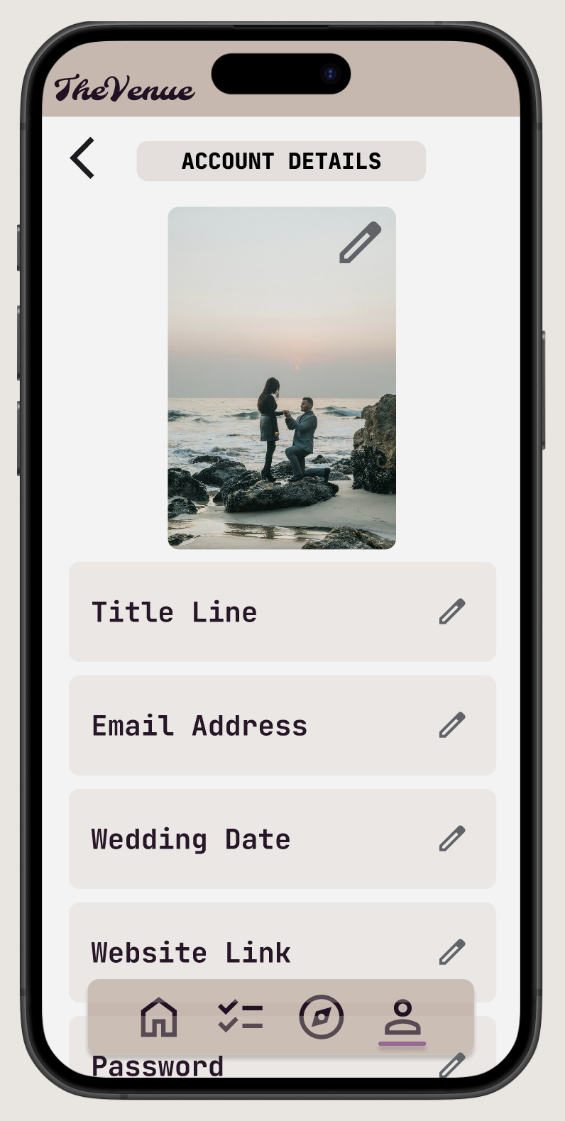
Account [App]
-
![]()
Checklist [App]
-
![]()
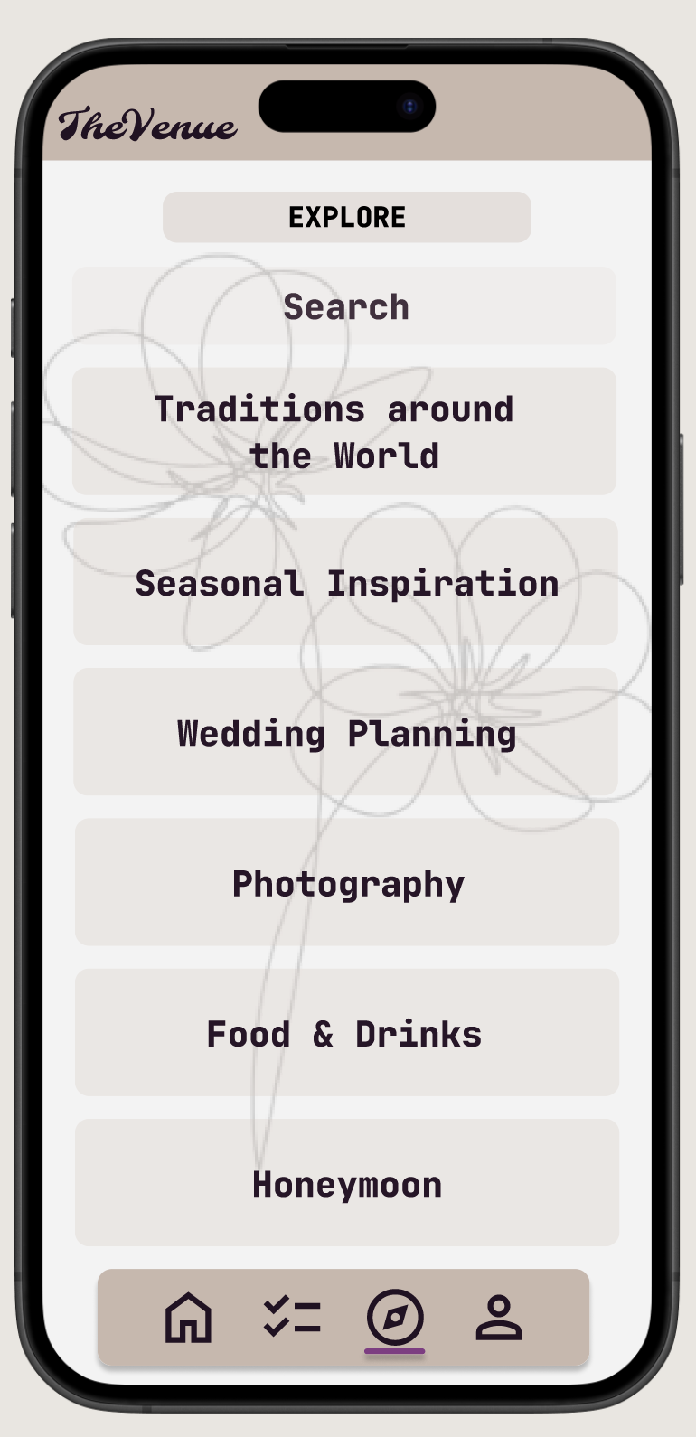
Main Explore [App]
-
![]()
Explore Articles [App]
-
![]()
Home Screen Options [Desktop]
-
![]()
Home [Phone]
-
![]()
Account [Desktop]
-
![]()
Checklist [Desktop]
-
![]()
Checklist [Tablet]
-
![]()
Checklist [Phone]
-
![]()
Desktop [Explore]
-
![]()
Explore [Phone]


Digital Wireframes
My main goals in creating the digital wireframes for The Venue were to make the app intuitive and organized. The target user needs an app to help them stay organized throughout the wedding planning. I created a basic app where clients at this venue can keep track of tasks, link wedding details, and explore articles related to wedding planning.
I decided the opening of The Venue’s website should be slightly different than the opening of The Venue’s app. I wanted the website to have the classic hero image aspect for prospective clients who do not have accounts yet. To do this I added a hero image of a couple at the fictional venue, then added a ‘My Wedding’ page which is the same page that the app automatically opens to (depicting a picture of the user’s choice, the couple’s title line, and a countdown to the user’s event).
My research participants felt that a single checklist came off as overwhelming for this large of an event, so this is when I decided to split the checklist into three separate lists to allow for more thorough organization.
-
![]()
Home Screen Options
-
![]()
App Wireframe
-
![]()
Desktop Wireframe
Defining feature: My Wedding page is customizable to each individual client
-
![]()
Tablet Website Wireframe
Defining feature: The Checklist page includes multiple collapsible lists for organization
-
![]()
Phone Website Wireframe
Defining feature: Desktop alternative screen sizes convert to hamburger menus for the main navigation


Low-Fidelity Prototypes
The flow of The Venue’s App begins with the home page [user’s photo of choice, title line, and event countdown]. There is an icon for the user’s profile in the top right corner [which includes personal information and account settings]. In the bottom navigation bar, there are three icons from left to right. Checklist [which includes a personal checklist], Home [the flows start page], and Planning [articles for the user to explore].
To make the experience feel more well-rounded, I started the flow of the website desktop with a general homepage [which includes a hero image, a top navigation bar, and further navigation below the fold]. The top navigation bar from left to right includes: The Venue’s logo [which always brings you to the general home page], My Wedding [user’s photo of choice, title line, and event countdown], Checklist, Explore [articles], and My Account.
In the website’s alternate screen sizes, the only difference in flow is that the top navigation bar condenses into a hamburger menu [that includes My Wedding, Checklist, Explore, and My Account].
-
![]()
App Prototype
-
![]()
Desktop Prototype
-
![]()
Tablet Website Prototype
-
![]()
Phone Website Prototype


Usability Testing

Unmoderated

3 Participants
Remote

10-15 Minutes

Low-Fidelity Designs: Findings
Backward Navigation
Add backward navigation to necessary screens & update certain screens to navigate back to the prior screen rather than a specific destination.
Button Sizes
Make buttons larger where necessary or group necessary layers to make buttons more functional.
Explore Vs Planning
Users responded better to the wording ‘explore’ over ‘planning’. They said that the wording ‘explore’ was more clear and direct.
High-Fidelity Designs: Findings
Explore Page Buttons
It was tough to read the text on the Explore page buttons. I decided to remove the images from the buttons and go with a cleaner design and make the text more easily readable.
Checklist Organization
The organization into Rehearsal, Wedding, and Day Of was something the users did not like, and they preferred a different organization or an option to edit the list titles.
Checklist Functionality
The functionality of the checklist was clunky. I upgraded my account at this point and learned how to utilize the states function in Figma to make the use smoother.
Design Evolution
Style
Pale Pinks, White, and Black
Pink evokes feelings of love, romance, and playfulness
White evoked feelings of simplicity and cleanliness
Black evokes feelings of sophistication, elegance, and authority
Color Palette

Explore Page
Removed photos from buttons to enhance readability
Removed fade from photos for an elevated look
Added a search bar for users who know exactly what they are looking for
Before Usability Study
After Usability Study


Overall Look
Updated the main navigation bar to include all nav components and made it a floating menu, including a feedback bar to show the user which page they are looking at
Updated buttons to be individual components with a sleeker design
Increased background opacity on edit pages
Added user logout message
Added floral details
Before Usability Study
After Usability Study


Accessibility Considerations
Colors
All text and graphics pass WCAG AA & WCAG AAA contrast ratios for accessible design
Buttons & Text Sizes
All buttons are a minimum of 44 x 44 px
All text is a minimum of 20 px
Alternative Text for Media
All media contains consistent, simple, and direct alternative text
Key Takeaways
The Venue was my first official design project. I learned so much about Figma and the overall User Experience Design process while putting together this app and website.
At the start of this project, I was utilizing Figma’s basic features and upgraded to Premium around halfway through. I feel that my design evolved not only as a result of the usability studies conducted and multiple rounds of iteration but also from the evolution of my Figma skills and access to more features.
One major lesson I learned while putting together my first project is that in user experience design, one can always improve. There is always more to learn about the functionality of the programs you are using, the design process as a whole, and, of course, the user.
I also learned not to go too overboard with my Figma designs. I added a lot of unnecessary, repetitive pages to get the full picture of the app and just created a lot of extra work for myself that did not ultimately benefit the design. I found it can be much more useful to focus on the user experience on an example of one page, especially when I do not have actual information to organize onto the app and I am working with Loren Ipsum like with The Venue’s Explore pages. Finally, I learned that you must always be open to learning and growing.
Next Steps

