
Joshua Harr Shane Foundation
March 2025 - Current
The Joshua Harr Shane Foundation is a non-profit organization that provides direct support tailored to individual circumstances.
The Client: A nonprofit organization
The User: People who need financial or other assistance, individuals looking to partner with, sponsor, or donate to the foundation
The Problem: The Joshua Harr Shane Foundation is a non-profit organization in honor of the late Joshua Harr Shane, which was started to continue his dream of helping others. The organization provides support based on people’s unique circumstances.
Over the last year, the Foundation has begun putting together a formal advisory board to optimize the organization. The foundation has run solely within the Harr Shane Family for the last 20+ years. Over the last few months, those of us who joined the board have been learning and observing to make recommendations on where we think they might have room for improvement or opportunities to attract new faces to donate, sponsor, and attend events.
The Goal: Concurrently, with advising on these matters, I am working toward updating the foundations website to reflect these updates and changes, strengthen the brand identity, and most importantly, improve the user experience of the website to increase traffic and retention.
My Role: Lead User Experience Designer
My Responsibilities: End-to-End Design Process:
User research
Competitive analysis
Wireframing
High Fidelity Designs
Prototyping
Usability testing
Review and analysis of data
Refining and updating the design
Handing off designs and work to the foundation’s current website developer to implement recommendations
Current JHSF Home Page
Recommended JHSF Home Page
Research Summary
During user research for the Joshua Harr Shane Foundation, I conducted many user interviews. I spoke with the Director of the Foundation and her family, new members of the advisory board who have vast experience working with non-profit organizations, volunteers, donors, and event guests. I did not speak to any families who are currently receiving support out of respect for their privacy. Some families will complete a testimonial after the foundation helps them, therefore, I utilized the testimonials and personal stories that had been given to the foundation prior, with consent.
Going into my research, I knew that the foundation already had an established group of people who consistently come to events and support. This led me to assume that this group of people does not use the official website often and would typically go right to the foundation’s Facebook page for event information and prefers to donate in person at events rather than online.
This assumption was correct, which showed that the majority of people using the official website are either new to the foundation and looking for more information, looking for support, or are interested in being a donor or sponsor.
Next, I was interested to find out what the website experience was like for individuals who had no background knowledge of the Joshua Harr Shane Foundation or what they do so I conducted a Usability Study on the original design. I had three individuals follow prompts to navigate through the website. Following their navigation through the site, I asked them about their experience, and I asked them some basic questions about the foundation to see how easy the site was to navigate and take in.
User Pain Points
Apply for Assistance
New clients were confused about where to officially apply for assistance. It took some time for most users to navigate to another page to find this information, delaying task completion.
The Foundations Mission
New clients were unable to state a distinct mission; they were all very vague and felt a little unclear about what and who the foundation supports.
Media Books
The media books contain all of the pertinent information about the foundation, but all of the users completely skipped over the media books and were unsure what I was talking about when asked about them.
User Personas
Angelina

50

Bachelors Degree

Yardley, PA

Partner+4

Stay-at-Home Mom
“My youngest child has a disability, and we could use assistance obtaining the necessary medical equipment they need.”


Simon
65
Masters Degree
Doylestown, PA
Partner+2
Doctor
“The practice I work with is looking to sponsor a nonprofit organization.”
User Journey
Previous Website Design
The Joshua Harr Shane Foundation website has been regularly updated by a friend of the foundation for the last 25 years.
My designs will be given to this individual as a consultative arrangement and will be implemented at their discretion.
In recent months the foundation has adopted its first official advisory board and is undergoing a brand update and overall restructure.
I am working with other members of the board on this restructuring to optimize the efficiency of information processing for our users while simultaneously making our branding more professional and the site more organized.
Likes:
Contrast of the Donation Button
Top Navigation Bar Style
Direct links to social media, mailing list sign-ups, and donations from the site
Dislikes:
Hero Image [I would like this to be Joshua]
Media Books [these are 15-25 page PDFs of information about the foundation; we want to find a way to organize and condense this information so that the user does not have to work so hard]
The user flow is a bit chaotic; some top navigation bar items go to a new location on the home page, and others go to new pages
Original JHSF Website [as of April 6, 2025]
Site Map
My goal while updating the site map for the Joshua Harr Shane Foundation’s website was to simplify the main navigation menu and distribute the child pages under each parent page a bit more evenly so the content appears less overwhelming.
These are some of the main updates I made:
First, I felt that there was too much information under the ‘About’ tab, which certainly works here, but I decided to organize it a little differently to make the information less overwhelming. To start, I combined the ‘How We Help’ page into the main ‘Services’ page as a small introduction. Next, I combined the ‘Stories and Honors’ under ‘Our Services’ and showcased different stories and honors with the services they were included under, respectively. Finally, the foundation’s committee and I also decided to organize the overall structure of the foundation’s services into clearer categories, which is reflected here as well.
Next, I decided to update the St. Pat’s Party tab to just a general Events tab. The foundation has two main annual events, so I wanted to showcase both of these events all year around so that users know what to look forward to. I also advised the foundation to introduce DIY Fundraising, which allows anybody to host a fundraiser for the foundation.
Then, I added a bit of information under the ‘Contact Us’ tab. The foundation just recently started working with a formal committee and advisory board so that will be showcased under this tab as well as direct links to information about becoming sponsors or volunteers for the foundation.
Finally, I moved ‘Planned Giving’ and nested it under the ‘Donate’ tab. This is not a reason people visit the website on a high frequency, and most who participate in planned giving are long-time donors so I did not think it needed to be included in the main navigation menu.
Original Website Map
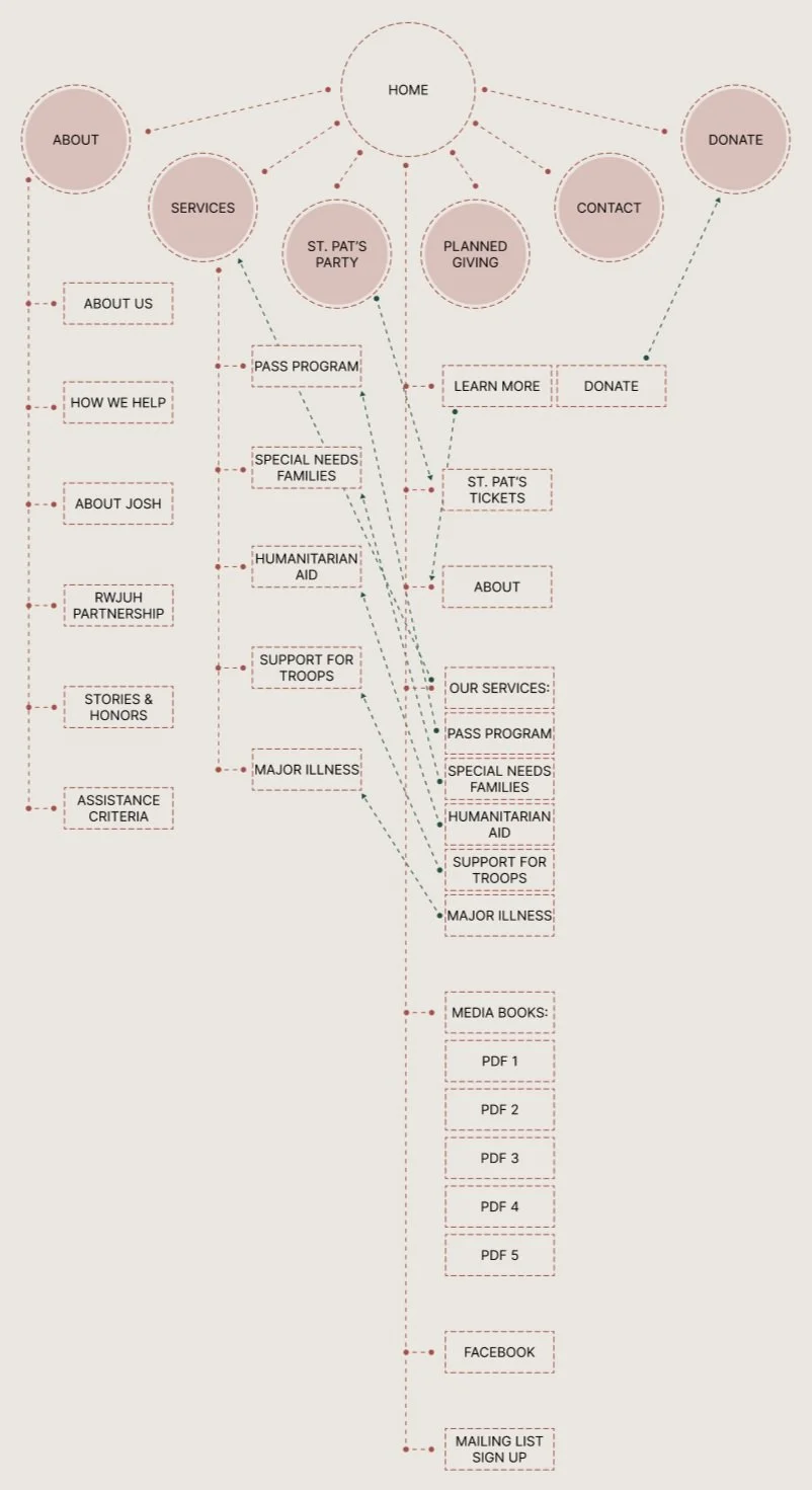
Proposed Website Map

Design
Site Style
The original site style has a blue and orange color pallette. I decided to keep this the same with the addition of a few shades, as people have been associating these colors with the foundation for the last 25 years.
Color Palette

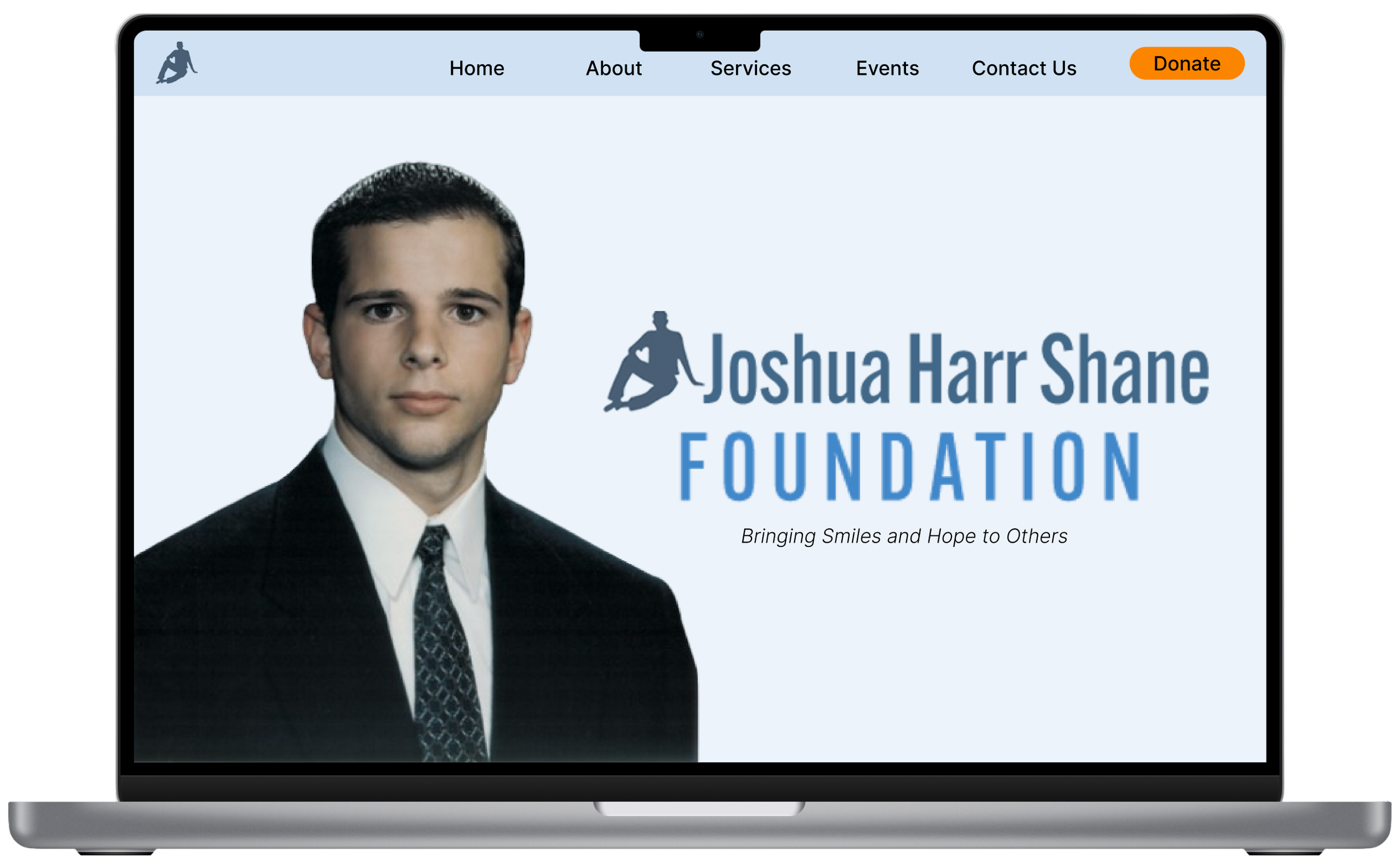
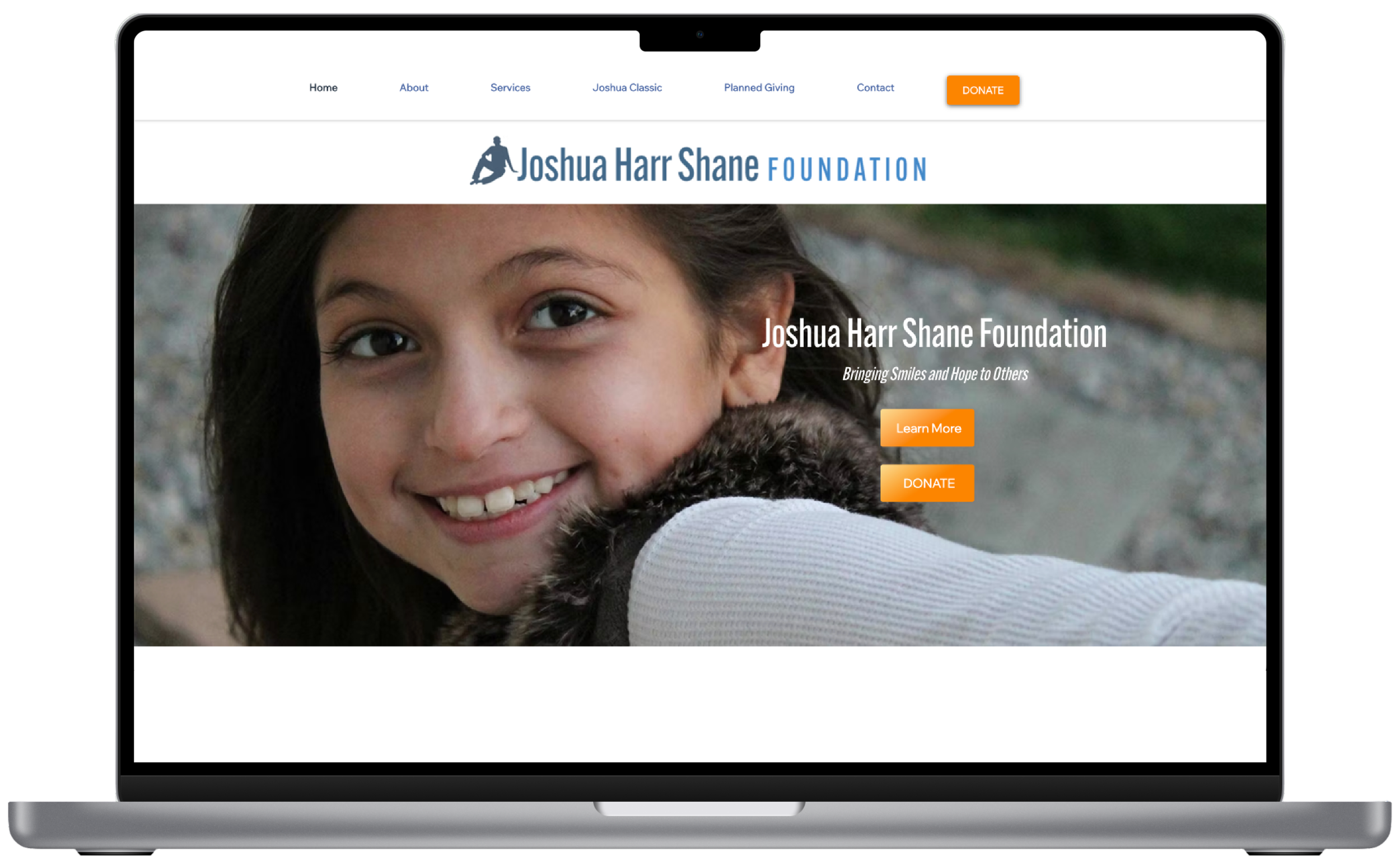
Hero Image
The hero image of the site is the user’s initial impression, and I feel that the impression feels off with the current hero image.
The current image depicts a child that the foundation has helped over the years, but new users do not know this and automatically wonder who this girl is and why she is the face of the foundation. This initial impression is confusing.
This image was used because the foundation has struggled to find horizontal photos of Joshua that are high enough quality to use as a hero image. I propose to use a background remover on a high-quality vertical image to include him in a way that does not require the photo to stretch across the entire screen. I believe that using a photo of Josh on the main page of the site will make the initial impression feel more intuitive for the user and create a sense of brand identity, allowing the user to associate the foundation with Joshua from the instant they open the website.
Current JHSF Home Page
Recommended JHSF Home Page
Under Construction…

We are currently in the middle of the Joshua Harr Shane Foundation busy season and plan to launch the new website design after our event in June.
I am in the process of working with the advisory board to continue working toward the final product of the updated Joshua Harr Shane website as much as I can while the foundation’s main focus is on executing our annual fundraising events.
I will continue adding my work as I work with the foundation and continue to work on these designs.

