
Project Overview


The Client: An Extinguisher Sales and Servicing Company
The User: Business Owners
The Problem: The Atomic Extinguisher Service, LLC website was last updated in 2019. In conversation with Atomic, I learned that they were not fully happy with their website. They felt the website’s overall design did not portray what the company does/create brand identity and wanted further consultation on the layout and design.
The Goal: Make it clear that the company is centered around fire extinguishers. My goal was for the client to affiliate the Atomic name with fire extinguishers without having to read any text.
My Role: Lead User Experience Designer
My Responsibilities: End-to-End Design Process:
User research
Competitive analysis
Wireframing
High Fidelity Designs
Prototyping
Usability testing
Review and analysis of data
Refining and updating the design
Updating Atomic’s website using GoDaddy [pending]
Research Summary
During user research, I was interested in understanding how Atomic clients most frequently use the company website, what their needs are as clients, and how I could help improve their experience. To understand this, I interviewed 5 people. 2 long-term clients and 3 of Atomic’s employees [both office administrators and technicians].
I asked Atomic’s clients what reasons they visit Atomic’s website and how often they visit the site. I asked Atomic’s employees what some of the most common services clients require and a bit about the company's background and other offerings.

“Since I have been a regular client, I have only used the site a few times to get Atomic’s contact information” -Client A
“I had zero knowledge of extinguishers before I started my business, but Atomic helped me figure out what I needed and set me up with a servicing schedule” -Client B
“The multipurpose A-B-C extinguishers are the most common among Atomic customers” -Employee B
User Pain Points
Where do I start?
What extinguishers do I need for my business?
What kind of servicing is necessary?
User Personas
Shepard

50

Bachelor’s Degrees

Philadelphia, PA

Single+1

Small Business Owner
33
Masters Degree
Philadelphia, PA
Married+3
Large Business Owner

“I just opened my small business and could use someone to help me figure out what type of fire protection is best for my needs.”


Carmela
“Fire extinguishers are used quite commonly in my business setting, so I need a company to come in and make sure we have the protection we need on an accelerated schedule.”
User Journey
Previous Website Design
Atomic Extinguisher Service, LLC's website was last updated by another designer in 2019. Atomic’s owners do not currently possess their domain information, so I am waiting on them to get it for me, so I can officially update their website.
Likes:
Philly Background (main servicing area)
The information included is clear
Design is responsive
Dislikes:
Hero Image (unrelated to company)
All information on one page (needs to be sectioned and organized)
Some typos
Previous Website Design [2019]
Site Map
My goal while creating the updated site map for Atomic’s website was to keep it simple, but split up the information included on the site into clear pages to minimize thought effort for the client.
I also added a page of information about extinguishers for potential clients and new business owners who may want more information before contacting the company.

Paper Wireframes
When I began brainstorming and creating paper wireframes for Atomic, my main goal was to organize the information into categorized pages. The original site was a single page with all of the information in one place. I decided that organizing this information would make it easier to take in. I also focused on ways to portray to the user that the site was for a fire extinguisher business nonverbally and very clearly.
-
![]()
Home [Desktop]
-
![]()
Home [Alternative]
-
![]()
Menu [Alternative]
-
![]()
Contact Us [Desktop]
-
![]()
Contact Us [Alternative]
-
![]()
About Us [Desktop]
-
![]()
About Us [Alternative]
-
![]()
Our Services [Desktop]
-
![]()
Our Services [Alternative]
-
![]()
Extinguishers [Desktop]
-
![]()
Extinguishers [Alternative]


Digital Wireframes
My main goal in creating the digital wireframes for Atomic was to make the design consistent and organized.
The target user needs to learn the basics about what the company does and decide if their services could be useful. I wanted to make taking in this information as easy as possible.
-
![]()
Desktop Wireframe
Defining feature: Extinguisher page includes extra information about extinguishers for newer clients
-
![]()
Tablet Website Wireframe
Defining feature: Images of fire extinguishers on on the Home page to help create brand identity
-
![]()
Phone Website Wireframe
Defining feature: Alternate screen sizes switch to a hamburger navigation menu


Low-Fidelity Prototypes
The flow of Atomic’s website begins with the home page.
In the top right corner is the navigation bar, which includes ‘About Us’, ‘Our Services’, and ‘Contact Us.’ The user can navigate freely between any of these pages.
-
![]()
Desktop Wireframe
-
![]()
Tablet Website Wireframe
-
![]()
Phone Website Wireframe


Usability Testing

Unmoderated

Remote

3 Participants

10-15 Minutes
Low-Fidelity Designs: Findings
Return to Home
The user did not have the ability to return to the main home page after leaving it
Design Inconsistencies
Inconsistencies in the design with how the pages downsize across devices
High-Fidelity Designs: Findings
Color Contrast
Some of the design elements and text did not contrast with the background enough to be seen clearly or be accessible.
Old Atomic Logo
The old-school Atomic Logo was updated to a newer, cleaner version, which also inspired the overall aesthetic design evolution.
Design Evolution
Site Style
The original Atomic Website was simply black, grey, and white. I decided to integrate a few shades of red into the color palette. I mainly used red to integrate some design elements and action buttons, and I kept the main text and information black and white.
I chose red because it is the color most commonly associated with fire extinguishers, but also because it is attention grabbing invokes feelings of urgency
I kept the black and white text to ensure the message is clear to every user.
Color Palette

Home Screen Design
My first round of hero image designs [Versions 1 &2] were inspired by Atomics Service Tags, and my second round of designs [Versions 3, 4 & 5] were inspired by Atomics’ business card, which has a more recently updated logo
The client preferred for the more recent logo to be used and liked the Home Version 4 the best
Atomic Service Card

Home Version 1
Home Version 2


Atomic Business Card
Home Version 3
*Home Version 4
Home Version 5


General Atomic Designs
After Atomic’s owners decided on their favorite hero image, they voiced that they still liked the designs not chosen for the hero image, so I found ways to incorporate them across the rest of the website
On the Extinguishers page, I updated the middle fire extinguisher to have a black handle so that the design does not vanish
On the Contact Us page, I added Atomic’s van since this image is depicted on their business card
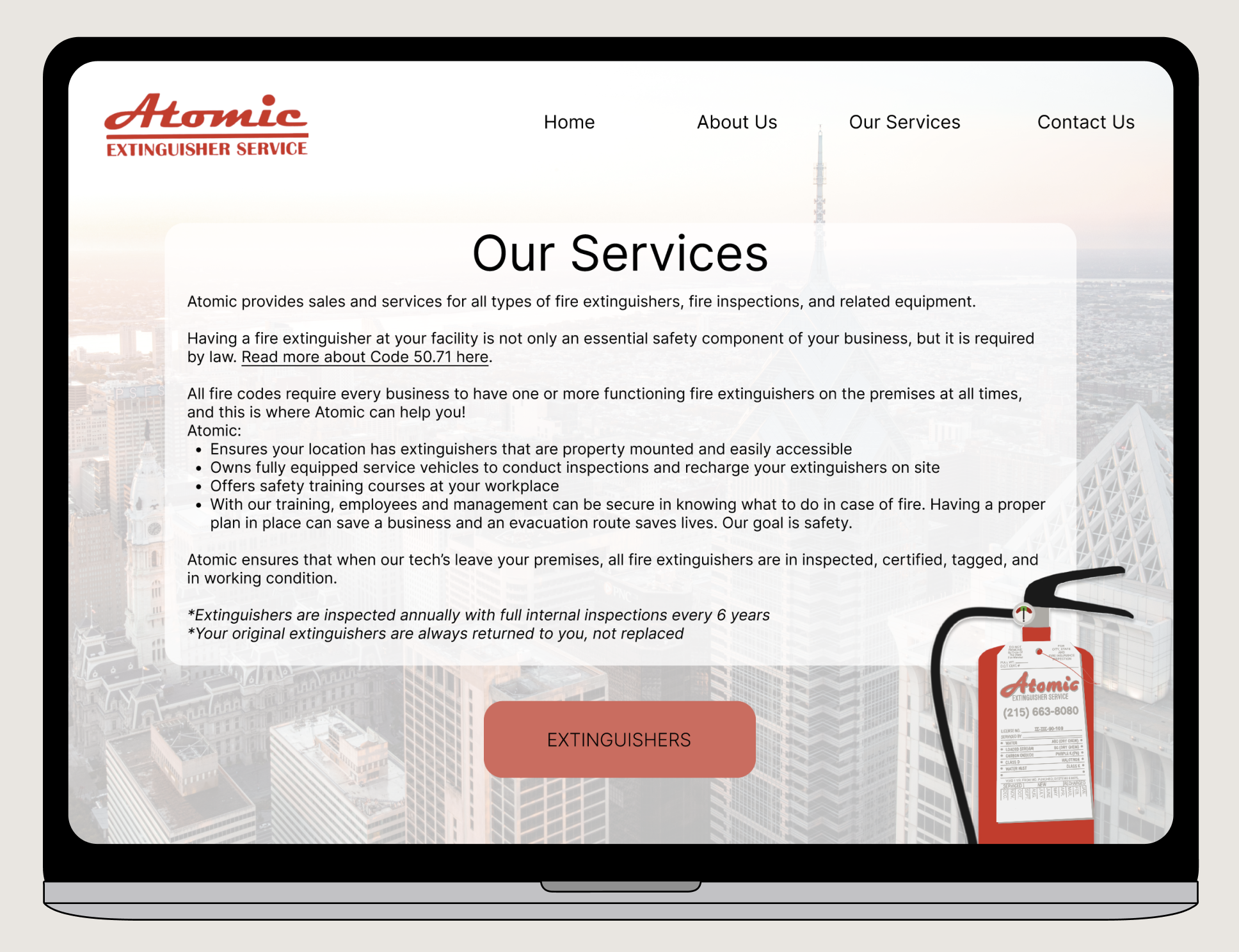
On the Our Services page,e I centered the design so it matched the rest of the website and put the service tag onto a fire extinguisher so it is easier to see the design
Extinguishers Version 1
Extinguishers Version 2


Contact Us Version 1
Contact Us Version 2


Our Services Version 1
Our Services Version 2

Accessibility Considerations
Colors
All text and graphics pass WCAG AA & WCAG AAA contrast ratios for accessible design
Buttons & Text Sizes
All buttons are a minimum of 44 x 44 px
All text is a minimum of 20 px
Layout
Aspects like hierarchy, color, typography, and a consistent and simple layout were all considered to make the flow of the site intuitive
Key Takeaways
This was the first project I completed for a true client. Luckily, the client is a close friend so she was comfortable being very honest with me through the process to help create the best product possible. Some parts of the process that I felt helped me learn the most were working with others, editing website information (compared to Lorem Ipsum text), and having the opportunity to update something instead of starting from scratch.
Working alongside Atomic’s team was helpful because it helped me gain inspiration from others at more points in the design process than just my usability studies. I was learning more about the company directly from the source, had an opportunity to bounce ideas off of the client whenever I needed, and had an opportunity to take inspiration from their service trucks, service tags, and business cards.
Finally, it was an exciting challenge to update a website rather than create one from scratch. It was a good opportunity to practice evaluating and refining a design, editing textual information, and reorganizing the website map to improve the user experience and enhance the design of Atomic’s online presence.
Next Steps

